Wahoo’s New ROAM: Color Me Satisfied
I’m the last guy you’d want to have writing this review of Wahoo’s new Elemnt ROAM on Slowtwitch. I mean that literally. Of the 5 or so people who routinely write or have recently written technical articles here on products that might be broadly characterized as “electronics”, I am the 5th stringer. Last on the depth chart. Garbage time if I’m lucky.
Which makes me oddly not such a bad choice, because here’s what Wahoo’s founder and CEO, aka Chief Wahooligan, Chip Hawkins, says about products like his Elemnt ROAM: “Using a bike computer shouldn’t be the hardest part of the ride.” If I can write this review in a way that is not depressingly adrift, maybe that accrues to the utility of the ROAM, versus products in its competitive set.
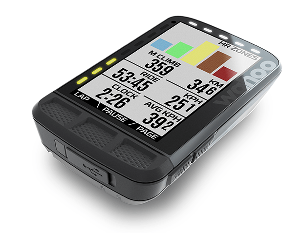
Here’s one problem with designing a product like the ROAM, if I may. The Elemnt was very good at what it already did; there wasn’t a lot of room for improvement. Nevertheless, there were some upgrades from my point of view and I mean that literally too. As I age, my lack of optical focus has sharpened my intellectual focus on two product categories: eyewear and head units. Simply put, I can’t see for spit anymore. Accordingly, something like the Elemnt Bolt, are you kidding me? Let’s talk about a screen I can see: the ROAM.
The ROAM’s screen, the viewport, is not any bigger than the existing Elemnt’s screen which, by the way, the old Elemnt will be phased out by the end of Summer with the release of the ROAM (you may find some cheaper Elemnts out there if you don’t value the ROAM’s upgrades, I'm seeing $299 right now, so, stock up!). What else did not change? The LED lights that ring the screen on the ROAM were there with the Elemnt. There is still, I believe, 4GB of internal memory, and a 17hr battery life.
Integration with your favorite apps? Yup. Wahoo has always played well with others. The ROAM continues this tradition but doesn’t, that I can find, unlock the key to any new integrations (is there anything left with which to integrate?). Wahoo’s strength is its own ecosystem cross-compatibility, and the ROAM continues this. You can manage your Kickr directly from the ROAM, and that was a big deal for Tony Vienneau when he published his long term review of the Elemnt 2 years ago. But I don’t care about that because if I’m cycling indoors, there’s a big screen in front of me, controlled by an AppleTV (Zwift) or by an iOS device (Rouvy).
The ROAM gives you prompts for incoming calls, and notifies you (if you want) of incoming emails (thanks but no thanks!) and text messages. But the Elemnt had that built in as well.
As well as I can tell, the major change is in visibility, which I value, and of course (me being old now) I’m supposed to get lost easier, right? The ROAM has some small but helpful navigational tools the original Elemnt did not include.
Navigation
The ROAM (like the original Elemnt) allowed the importation of routes. There were little chevrons that helped you along, told you where you were, when to turn. (Likewise the ROAM.) The difference is in the ease by which the maps are seen on the screen. The ROAM’s screen is in color. Not color as in Technicolor, rather the features are separated into 8 or 10 different colors (chevrons are one color, roads are another, locations of friends are another, prompts are another, and so on). The more tired one’s eyes – through age, or after having ridden a bunch of miles already in a ride – the more welcome this feature. When you ride with the ROAM, and then go back and ride with a black & white screen, you’ll see the difference.
Turn-by-turn directions are another new feature of the ROAM, tho this wasn’t live during my time riding with the ROAM. This follows a theme, that if modern navigational utilities (from Apple and Google) do it, Wahoo thinks your bike’s head unit should do it. Consequently, one new feature is a return-to-course. This is somewhat analogous to your smartphone’s dynamic rerouting feature, if you fail to make a turn.
If you’ve uploaded a route, but you need to get to the start of that route, the ROAM now has a get-me-started feature that will navigate to the route’s commencement location. (And it’s a bike-friendly route.) There’s a pair of new zoom levels that grant you a more granular view, and the maps zoom to higher resolution when you use that increased zoom.
Then there’s something I think might be significant to the gravelers among us, though I haven’t been able to deploy this yet and to enjoy its virtue: MTB trail integrations: the ROAM now integrates with Singletracks and MTB Project to overlay mountain bike trails onto the ROAM’s navigation screen.
Elevation data on the old Elemnt was only available on imported maps. Now it’ll be available all the time, tho just like turn-by-turn navigation this isn’t deployed quite yet (it’s a few weeks off, as of this writing).
Industrial Design & Ergonomics
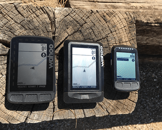
The ROAM is really a Bolt supersized up to the Elemnt’s volume. (I show some images just above of the old Elemnt, the Elemnt ROAM, and the Elemnt Bolt side-by-side.) The buttons on the ROAM – both on the side and on the face – are the Bolt’s buttons (just upsized). The one complaint I have of the ROAM is that the buttons have a different feel to them when depressed. There’s a satisfying click when you depress the Bolt’s 3 below-the-screen face buttons. On the ROAM, not so much. I thought it might just be my unit, but I’ve now used a pair of ROAMs and this is just the ergonomics of this product. The buttons on the unit’s face belonging to the Bolt – which I can’t ride with because I can’t see the darned thing without a microscope – are the most satisfying buttons. The old Elemnt is my next favorite, and the ROAM my least. But small matter. The screen makes up for this complaint.
Companion App
If you aren’t a Wahoo head unit user, there’s a Companion App for these products and this flows from Wahoo’s very beginning, when its product was an iPhone app. I’ve got an iPhone and pairing the ROAM (or any Wahoo head unit) with the app couldn’t be easier. It’s that thing where you hold a UPC code up to your phone’s camera.
Most of what you need to do on a ROAM you can do without the Companion App. But there are some things that need the app. One example: If you do use the navigation screen on your ROAM you have the choice of data fields you’ll want just above the nav screen. Those data fields are selected in the Companion App.
Mounting Hardware
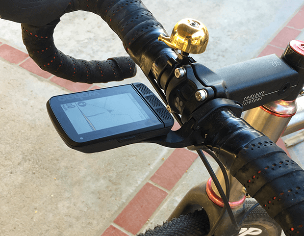
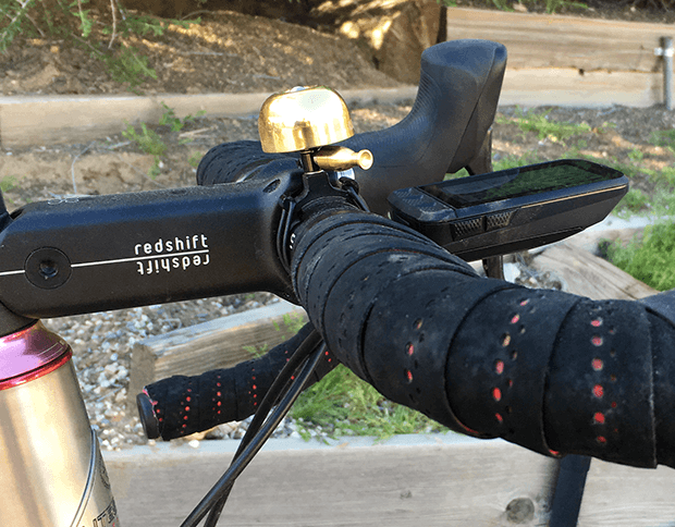
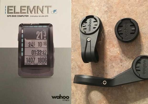
A fact of modern cycling life is that the space around the handlebar is becoming dear. More so in triathlon, where food, hydration, shift buttons, junction boxes and data are all battling for real estate. As you can see, the ROAM mounts flush with the handlebars and perhaps I wimped out by showing you how I mount it to my gravel bike. And yes, there’s still room for my bell, the one thing on my bike that does not require electricity.
I do have a very tidy set up on my tri bike, all that required stuff fits on there, and an Elemnt sat nicely, just so. Rather than messing with my set up I just snapped out the old Elemnt and snapped in the ROAM. Done. Old mounts work. That original Elemnt mount is not flush mount, so, my advice, figure what among the various Wahoo-compatible mounts suits that little village of stuff that sits on your handlebars. Maybe it’s this new mount, maybe not. In my case, not. However, I like the flush mount on my gravel and road bikes, where I’m not carrying around so much stuff (my tri bike looks like the Clampett’s truck).
The price! When the Elemnt debuted, 3 years ago, it sold for $329 or so according to our reporting contemporaneous with that launch. The ROAM sells for $379. You decide whether what I write above, plus a little inflation, justifies the $50 bump. Read more about the ROAM at Wahoo, or on the inevitable thread starting today on our Reader Forum.



Start the discussion at slowtwitch.northend.network