On Design

I am a race director.
It's taken me seven years to admit that. Seven years to realize that my job, my career, my calling revolve around producing sporting events for others to attend.
Seven years ago this week the idea of the Musselman Triathlon was conceived while I was living in the Finger Lakes region of New York; over the past few months you've been reading the series of articles penned for Slowtwitch chronicling its creation. Over the next few months a new series will emerge, this time looking back. I now organize three events, In addition to Musselman, there's also the Fly by Night Duathlon and the Freshwater Trust Portland Triathlon. The coming installments will interweave tales from all three.
"This is fun already, isn't it?" (Russell, from Up)
I may be a race director now, but I retain elements of my former lives. On any given day I may be a teacher, a student, a computer programmer, a graphic designer, a writer, a curmudgeon. I make the distinction, made by many before me, between a job, a career, and a calling. A job is what people do to satisfy life's necessities: food, clothing, and shelter. A career ties the little day-to-day details into a whole, a cohesive body of work. A calling is what you would do regardless of whether or not you were paid. I am grateful that my life as a race director fulfills all three.
Design infuses all things. From the smallest pencil to the largest particle accelerator, design can make our world beautiful… or confounding. The world of triathlon is no exception; a well-designed event can bring joy, satisfaction, and hope; a poorly-designed event disappointment, animosity, injury.
The Musselman Triathlon was conceived with no particular design in mind. It was my first triathlon as an organizer; the basic goal was to make it to the end of the day on July 11, 2004. The following year Fly by Night was born, and with it the first rumblings of design-influenced planning. Three years later, the Portland Triathlon came to be, and its design was deliberate and rigorous from the beginning. Each step in this evolution has taught me something new; any subsequent race I organize will likely draw lessons from all three.
"What have I gotten myself into?" (Mr. Fredricksen, from Up)
Examples of what I like to call thoughtful design are all around us. Pixar movies. Waterford bicycles. Silky Mebae garden tools. The poems of Dylan Thomas. Elements of poor design, unfortunately, are also readily available. When I was a child, windows in the family car were rolled down manually, by turning a handle in a circular fashion. You instinctively knew which way to turn the handle to make the window go up or down, and the system worked well. At some point, automobile engineers decided to electro-automate the process and henceforth a simple press of the finger powered the hapless window straight up or straight down.
Until it broke. Then you were left driving through a thunderstorm with a wildly open window, or driving through a Nevada summer with the greenhouse glass sealed shut. At some point, these woefully undertasked engineers decided you shouldn't need to hold down the button for the entire 5 seconds it took for the window to unfurl, so a quick flick sent the window all the way down. Those of us, such as myself, who have yet to master the quick flick were left with instantaneous and bone-chilling blasts of early-spring air when all we wanted was a sip. Any efforts to effectively modulate a precise amount of openness resulted in an epileptic game of up-down-up-down until total frustration prevailed and the window triumphantly proclaimed itself all the way open, all the time.
This design, in my humble opinion, is neither helpful nor progress. It was borne of laziness and waste, not of utility, and that is where thoughtful design always breaks down. Just like the window.
Sporting events, and triathlons, can be designed thoughtfully. Decisions can be made from the outset that not only drive efficiencies and minimize waste, but infuse the race with personality. In the year following the first Musselman, I was smitten with triathlon. I wanted to hold a thousand different races in a thousand different places, and every park (or river, or highway rest stop) looked, to me, like an ideal venue. Most of all, though, I wanted to hold a nighttime triathlon.
I mentioned this to Tom Reho, a good friend and the Musselman's trusted site manager. "Why don't you hold a race at Watkins Glen International?" he suggested. "They have lights."

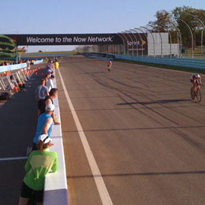
That was the beginning of Fly by Night. It turns out that The Glen, one of the oldest and most historic race car tracks in the country, has neither lights nor a nearby body of water, so the race is neither at night nor an actual triathlon (it's a Formula I format duathlon). But from inspiration and imagination (and none-too-little perspiration) came innovation, and an evening race utilizing all the features of the twisting, turning, rising, and falling track—including spectating the Porsche Clash by day and using pit row for transition—arose around a thematic design.
The difference between good design and bad design can boil down to the amount of thought behind it. In college I took a course in the computer science department called COS 341: Discrete Mathematics. To this day I could not tell you what knowledge it attempted to impart, but I do remember a particular passage from the textbook that was often repeated throughout the pages. It read:
***STOP and think about this.***
The passage included the little asterisks and the zealous capitalization, and it made me sit up and, if not actually think about the combinatorics being presented, remark to myself that this was some kind of unique textbook.
The world would include more good design and less bad design if people in the business of creating things—which amounts to everyone, really—would
***STOP and think about this.***
Don't just pause and look up from your coffee. Put the pencil down. Step away from the iPhone. Turn off the TV. And think. Consider what would happen, under each conceivable circumstance, if you were to implement what you are envisioning. Your triathlon, or website, or widget, would be safer, more fun, and more useful (for everyone involved) as a result. And the blasted thing wouldn't break driving away from the tollbooth during a blizzard.
Let me give you an example of how thoughtful design can improve triathlon. In 2004, the first year of the Musselman, the owner of the Geneva Bicycle Center, Jim Hogan, created the inaugural 56-mile bike course for the half-ironman. It was breathtaking in its scope, taking in two deep lakes, immaculate Mennonite farms, and the breadth and depth of Seneca County's rolling vineyards. It was also a single loop, which met our goal of prioritizing the athlete experience but also succeeded in each member of the bike support team tearing out large swaths of their own hair on raceday. It was simply too large geographically.
In 2008, after having used this course for four years, I had the happy opportunity (afforded me by the delightful and unequivocally undertasked folks at NY State Department of Transportation and their "Multi-County Speed Contest" permit application) to design a new bike course. Four years of trying to manage complicated intersections and a course that stretched a full 26 miles top-to-bottom would now be put under the microscope and redesigned.
The design constraints, in my mind, were these: The new course must continue to be a single loop of exactly 56 miles; this would uphold our promise to the athlete. The course must continue to be scenic and challenging. But it must also minimize stoplights and stop signs, as these are the most dangerous elements of any course. And the overall footprint of the race—its span from north to south and east to west—should also be minimized. This would enable better stocking of aid stations, better volunteer (and police) oversight, and faster reaction time to disabled cyclists.
Musselman 2008-2010 Course Map
The new bike course met these requirements. It came to be through many hours of ponderously staring at a map (no writing, no sketching, no driving around). If something didn't quite work—if it didn't satisfy the design elements dictated at the start—the path was scrapped. In good design, compromise plays a role, but it doesn't trump all. Just as important as what's created is what's been left behind. In a broader sense, you build by removing (a step in the registration process; a piece of equipment; fewer but better-located aid stations), and you gain by simplifying (a right turn instead of a left turn; a volunteer instead of a sign, or vice versa).
And good design is beautiful. If you have ever seen a Trangia campstove, you know what I mean. Each piece fits the whole perfectly; there are no extraneous parts; indeed, there are fewer parts than you would ever imagine would be necessary to create fire and boil water. Complexity is reduced to essential function, and once function has been defined, freedom and creativity can spring forth from those constructs. Good design becomes art, and art is what we remember.
Triathlon exists as an art form, as truly as Picasso and Brahms and Milton. It can move you, fill you with emotions you never knew you had. These artists did not happen upon genius like a leprechaun upon a pot of gold; the beauty that stirred from their canvas, chord, and quill came about through deliberate, intentional choices. They knew what to include, and when. They knew what to discard. And through the process, stories emerged that thrill us just as much as the final performance.
I invite you to join me as we tell stories from seven years of Mussel.
Upcoming series installments:
On Design
On Beauty
On Technology
On Liveability
On Stories
On Disaster
On Innovation
On People
On Community
On Fun


Start the discussion at slowtwitch.northend.network